EdTech · UX Studio · Iterative research & redesign
Making a language app feel grown-up, without losing the fun
How I used iterative research to help Xeropan appeal to adult learners while protecting the experience existing users loved.
Xeropan’s lessons were engaging, but its visual identity gave potential customers the wrong impression: people who might pay for the app often assumed it was designed for children. I led research to understand how alternative visual directions changed that perception, identify a direction that still communicated the product’s purpose and check that the redesign worked for people who already used the app.
- Methods
- Mixed methods
- Evaluative research
- Comparative concept testing
- Strategy & influence
- Reframing the problem
- Iterative research strategy
- Balancing acquisition & retention
- Insight to design decisions
- Research practice
- Transparent impact reporting
- Client
- Xeropan, a language-learning game
- Role
- UX Researcher at UX Studio, leading research from the preference tests onwards
- Timeline
- Late 2019 – summer 2020
- Team
- Me leading research, Zsófia Paszternák leading design, alongside the client’s CEO
- Participants
- 70 five-second testers, 40 prototype participants, 10 long-time users
- Methods
- Evaluative research: five-second tests, prototype interviews, remote usability tests, testing with long-time users
- Tools
 UsabilityHub (now Lyssna)
 InVision
Outcome
- Six months after release, Xeropan’s CMO reported a 3% increase in Day-1 retention and a 5% decrease in iOS trial cancellations.
The challenge
A positioning problem, not just a usability problem
The CEO was receiving positive feedback about the learning experience, but app-store conversion and paid sign-ups were below expectations. An earlier discovery round, led by my UX Studio colleague Antoine, had identified a mismatch between the product and how people perceived it.
“Is it for kids?” “Looks cartoonish.”
- The intended audienceyoung adults learning English for travel or work
- The first impressionthe cartoon-like visuals and Professor Max mascot suggested a children’s app
- The actual experiencepeople enjoyed the exercises and found them useful
- The commercial barrierthe premium price felt fair, but the extra value wasn’t clear
This changed the question we needed to answer. Rather than assuming the lessons needed redesigning, we needed to investigate whether the visual presentation was stopping the right audience from recognising the product’s value.
The research question
How might we make Xeropan feel relevant to adult learners without losing its playful character, making its purpose less clear, or alienating existing users?
I worked with the designer to test progressively different visual directions, moving from rapid first-impression testing to deeper prototype evaluation and, finally, feedback from long-time users.
My research strategy
I designed the evaluative research as a sequence of decisions. Each stage addressed a different uncertainty and informed what we tested next.
Establish what people understood at first glance
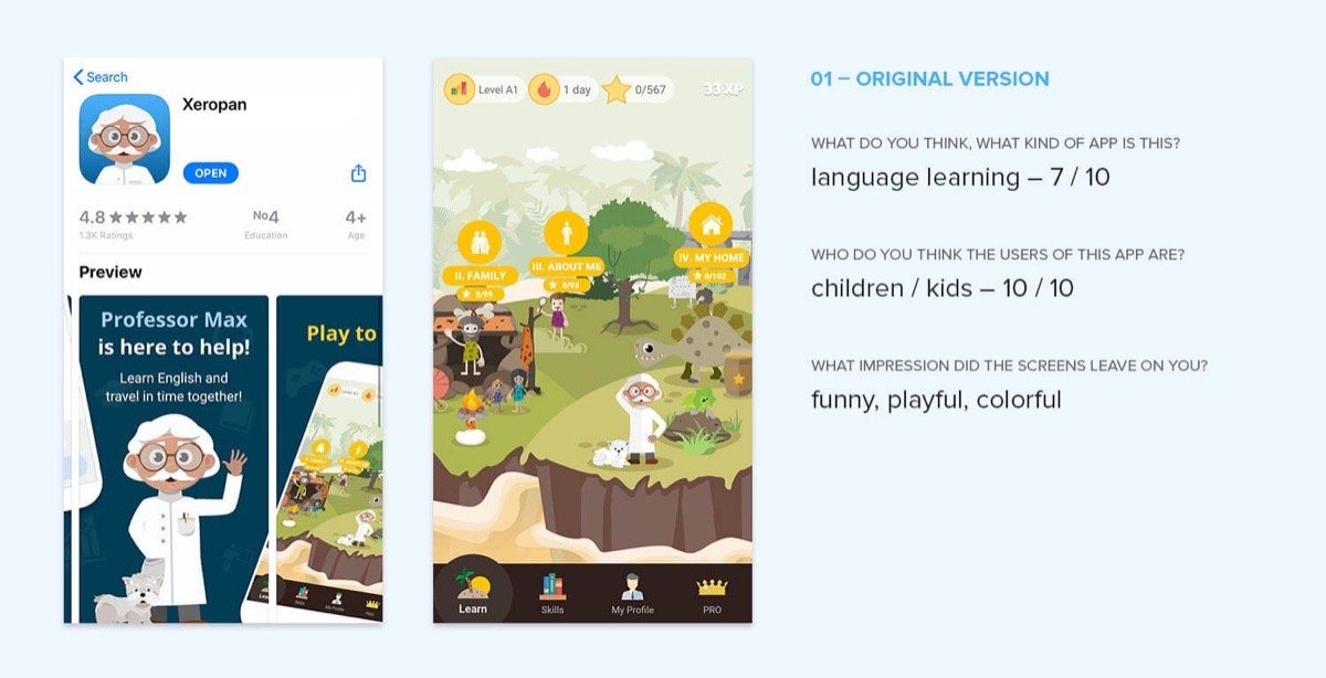
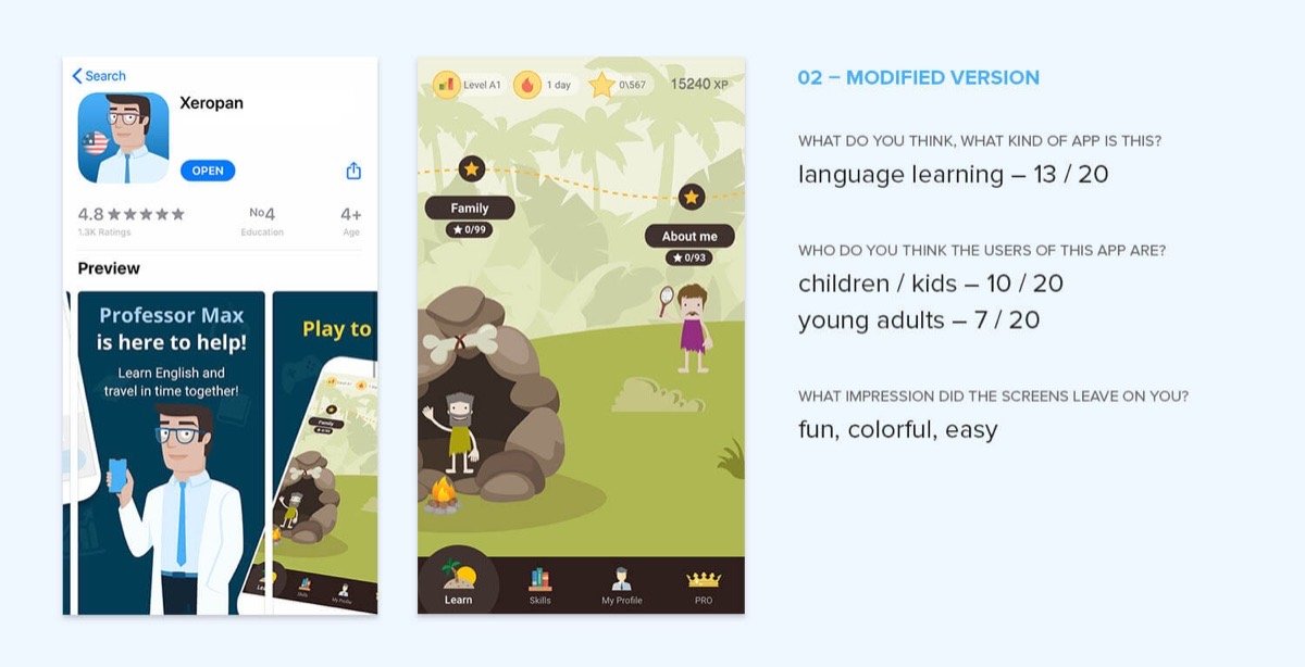
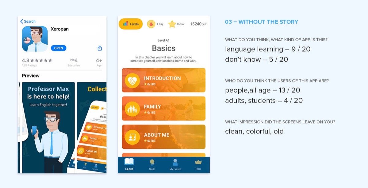
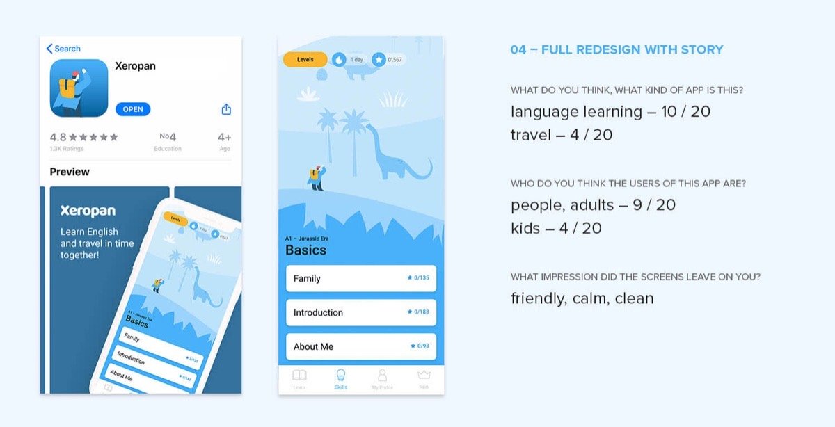
I ran five-second tests on UsabilityHub, starting with the original App Store presentation and then testing three alternatives. Participants briefly saw each design and described what kind of app they thought it was and who it was for. This tested the positioning problem directly: whether the visuals communicated a language-learning product for adults, not simply whether people liked the design.
What we learnedThe original design was strongly associated with children. Changing the visual direction could shift that perception, but removing too much of the story risked making the product’s purpose less obvious.
Understand why perceptions changed
I followed the tests with 15 in-person prototype interviews to explore the reasoning behind first impressions, then 25 remote usability tests with clickable InVision prototypes. A design that looked more mature still needed to help learners understand the app, navigate its content and follow their progress.
What we learnedThe choice wasn’t simply between playful and serious. We needed a direction that communicated adult suitability while keeping enough of Xeropan’s identity to stay recognisable as an engaging learning experience.
Test the trade-off with existing users
The research had focused on attracting potential customers, but a bigger visual change could also disrupt the experience of people who had used Xeropan for years. Near the end of the redesign, I tested the new prototype with 10 long-time users, to see whether it felt like losing the familiar product and whether they could still find their lessons and understand their progress.
What we learnedThe redesign initially surprised some loyal users. But they could still find the important pages, understood the learning structure and found the new level screen easier to navigate.
Four directions, one decision
I worked with the designer to compare the original design with three variations. Each helped us understand a different part of the problem.
| Direction | What we tested | What people said | What the evidence suggested |
|---|---|---|---|
| 1. Original | Professor Max and the busy time-travel island | “Is it for kids?” “Looks cartoonish.” | All 10 testers associated it with children, although most recognised it as a language-learning app. |
| 2. Younger teacher | A younger, more teacher-like professor and a simplified island | Still childish, though the imagined audience got a little older | The perceived audience shifted somewhat, but the design still felt childish to many testers. |
| 3. No story | The story and island removed, with the existing colours and style kept | An app for “adults, professionals” | It felt more suitable for adults, but fewer testers clearly recognised it as a language-learning app. |
| 4. Full redesign | A cleaner, simpler story with an explorer character | An app for “people” | Adult suitability improved while more of the language-learning purpose stayed recognisable. Some testers read it as travel-related. |
The five-second test results
| Version | Saw a language-learning app | Who they thought it was for | First impression |
|---|---|---|---|
| 1. Original | 7 of 10 | Children: 10 of 10 | funny, playful, colourful |
| 2. Younger teacher | 13 of 20 | Children: 10 of 20 Young adults: 7 of 20 | fun, colourful, easy |
| 3. No story | 9 of 20 (5 didn’t know) | All ages: 13 of 20 Adults and students: 4 of 20 | clean, colourful, old |
| 4. Full redesign | 10 of 20 (4 said travel) | Adults: 9 of 20 Children: 4 of 20 | friendly, calm, clean |
The fourth direction offered the most promising balance: 9 of 20 testers described it as being for adults, compared with all 10 testers associating the original with children. But only 10 of 20 identified it as a language-learning app and 4 associated it with travel. The positioning problem wasn’t completely solved. The findings helped the team choose a direction that improved adult appeal, while showing where clarity still needed attention.
From research to design decisions
With the client, we selected the fourth direction and agreed a three-month redesign plan covering the main screens, a new visual language and illustration guidelines. The lessons themselves stayed unchanged, so the work focused on how learners encountered and navigated the experience.
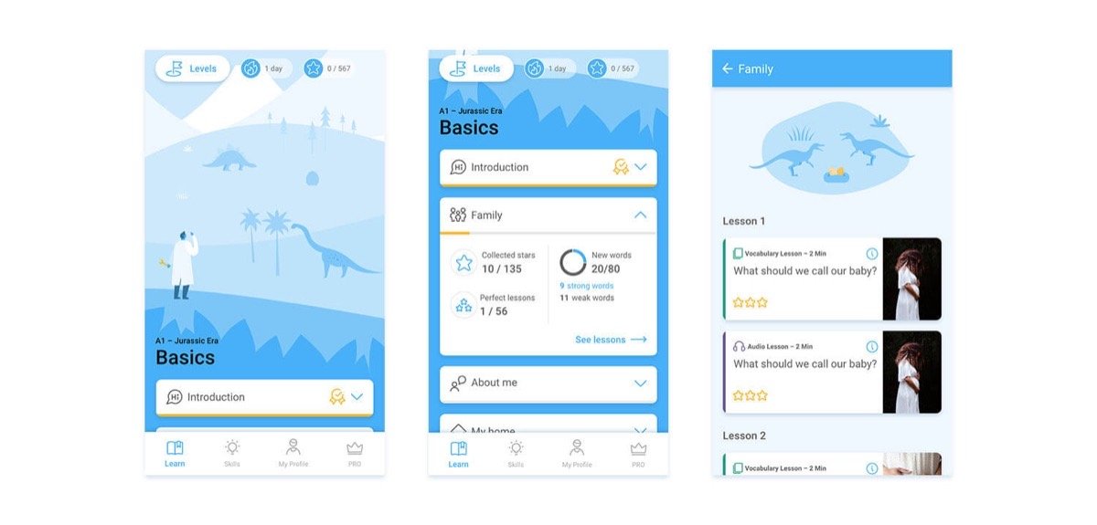
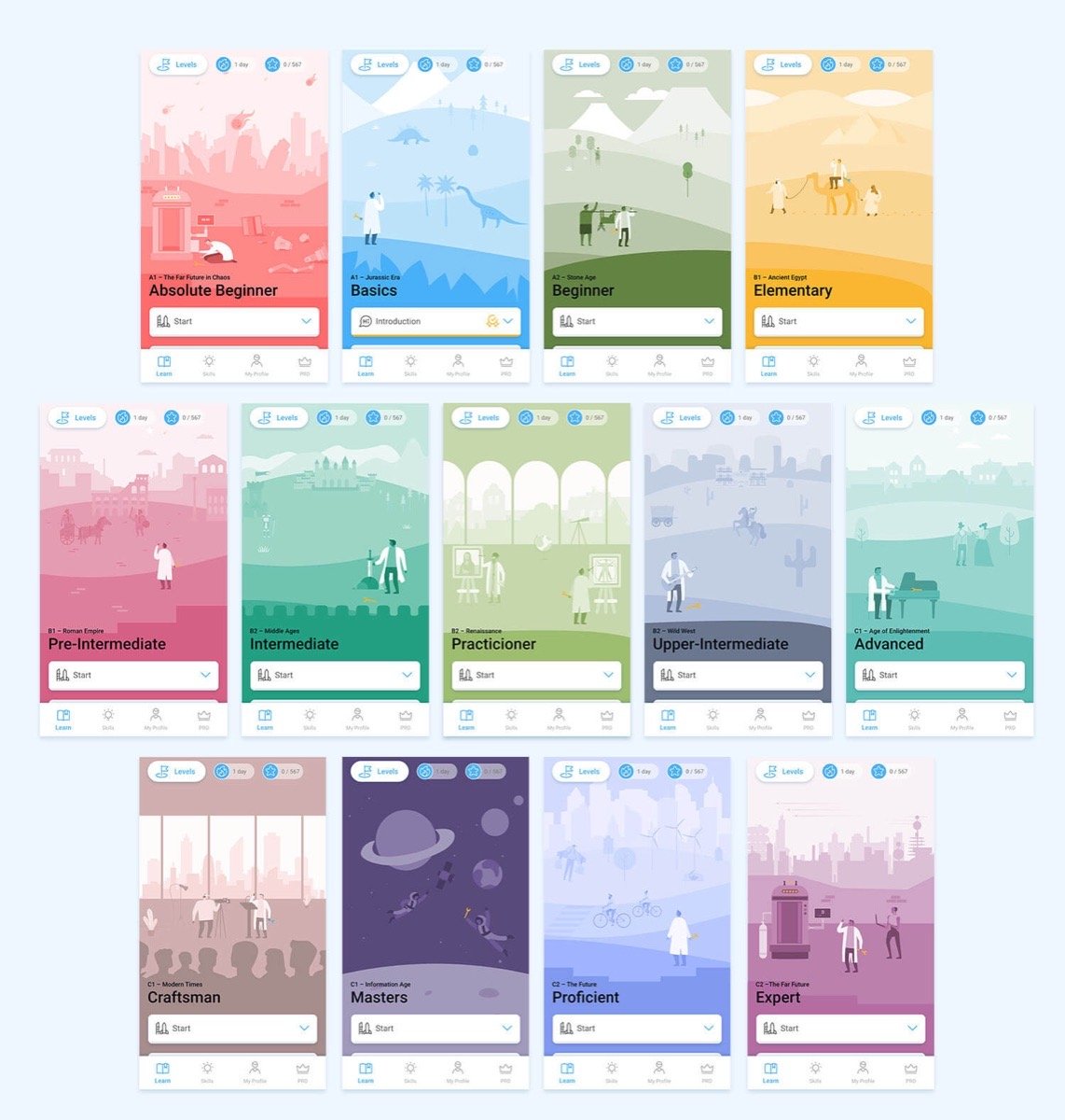
- Calmer illustrations: a more spacious, approachable style instead of the busy, children’s-book-like scene.
- A vertical level map that scrolls to the learner’s current position, replacing the horizontal island people got lost on.
- Topic cards with visible progress, so learners understand where they are and how they’re progressing.
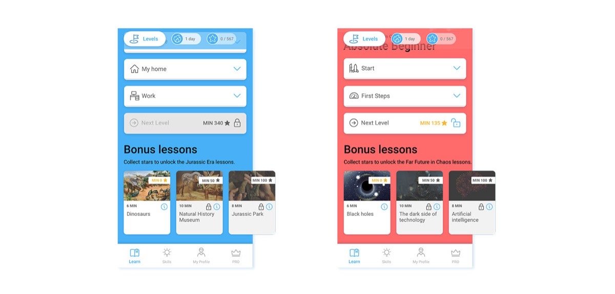
- Optional bonus lessons, keeping the game’s rewards and story for learners who enjoy them, without making extra content mandatory.
The goal wasn’t to remove the playfulness that made Xeropan engaging. It was to make that playfulness feel appropriate to adult learners and support the core learning experience more clearly.
Validating the change with loyal users
The long-time-user sessions showed the difference between an initial reaction and a considered evaluation.
Surprise
“Less colourful, more serious, clean and… different.”
The verdict
“Now it doesn’t look like it is for children anymore.”
Their feedback helped us assess the risk of changing a familiar interface and suggested that a more mature visual identity didn’t require removing the features and learning experience people valued. A redesign can create short-term surprise even when the underlying experience stays intact; testing with existing users let us understand that response before release.
Impact
Six months after release: Day-1 retention up 3% and iOS trial cancellations down 5%.
Comments about the app looking childish disappeared.
The new interface was easier to navigate and progress was clearer.
These outcomes need context. The release landed in summer 2020, as lockdowns eased, making it hard to separate the redesign’s effect from wider changes in user behaviour; downloads took several months to recover before exceeding their spring levels. I’d describe them as outcomes reported after release, not as improvements caused by the redesign alone.
Key learnings
- First impressions can be a product barrier. People formed an opinion about Xeropan’s intended audience before experiencing its lessons, so research needed to examine that first interpretation, not just usability inside the app.
- Comparative testing made the trade-off visible. Testing several directions showed that looking more mature wasn’t enough: the product still had to communicate that it was for language learning.
- A successful redesign must account for existing users. Long-time users’ initial surprise showed why familiar experiences should be understood and protected, not treated simply as constraints on change.
What I’d do differently next time
I’d involve existing users earlier and more continuously, rather than testing the new direction with long-time customers mainly near the end. Their expectations and attachment to the familiar experience could have shaped the design criteria from the outset.
I’d define acquisition, conversion and retention measures before release, alongside the perception and usability measures used during research, to give a clearer basis for evaluating the redesign over time.
And I’d investigate the remaining ambiguity more explicitly. Adult suitability improved, but only half of the final five-second-test group identified the design as a language-learning app. Further testing could show which visual cues suggested travel rather than language learning and whether they could be refined without losing the more mature positioning.